Still relying on Arial or Helvetica? Or just want to freshen up your brands identity? This might be the quick typography run down you need.
Typography is sometimes overlooked, but is an important way we develop not only our brands identity, but also the identity of individual pieces of content – Setting the tone and expectation on both a conscious and subconscious level. It can enhance the user experience, the impact of the story and overall add life to what can otherwise just feel like a bland block of text.
To dive into it, here’s a short list of considerations when choosing a fonts, whether it’s for your brand, or for special edition pieces:
Set the tone
Typography can set the tone just like images and colour-schemes, it’s one piece of the puzzle. Typically newspapers and magazines aimed at professional audiences opt for maximum readability, something that feels serious and not too wild, favouring function over form.
Compare the article headlines of OK Magazine and The Financial Times:


Just from the font alone, OK Magazine’s tone feels fun, it’s easy on the eye thanks to the bold and rounded edges. The Financial Times on the other hand instantly feels serious, the serif font reminding us of typical newspaper headlines.
A reader likely wouldn’t get the same impact reading a headline about how the financial markets are crashing if the font used was ‘fun’ and whimsical. The above are relatively light examples, and publications like OK Magazine can and do manage to use some extremely eye-catching typography, especially in their print offering which focuses more on design, while their digital is a lot more uniform.
Readability
Readabality is how well you can read the words (legibility is how well you can read the letters), and while some fonts might seem readable in a short headline, once you get into paragraphs it can feel fatiguing. See this example:

The boldness stands out, though once you get into the meat of the text it begins to feel as though it all merges into one dark maze your eyes have to navigate, rather than easily flowing-through like the Light example on the left.
If your brand isn’t too restricted, it always helps to add some flavour to headlines where possible, but for body text stick to something that feels good to read, that can be skimmed if necessary.
Hierarchy
Some of the best looking content we’ve seen employs different fonts to indicate hierarchy, hand in hand with styling and sizing, it really brings the typography together. The hierarchy of headline, subtitle and body text is usually obvious, and good designers put a lot of thought into it to keep the most important information at the top of your focus, while still letting subheadings have impact.
Canva wrote a great piece on this (although a long one), it’s worth at least skimming through, as they also provide perfect visual examples:
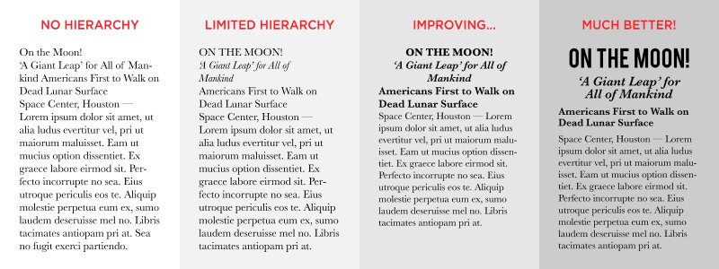
In this example, Canva displays how employing different fonts, sizing and styling all at once can really bring content together to guide the reader and having way more impact.
They describe three levels of hierarchy, which can be summarised as:
- Grab attention
- Create curiosity
- Add context
Brand Recognition
Fonts are a part of your brands identity, your editorial design is a constant that readers come to expect, and it’s easy to feel as though a real identity is hard to carve out without straying far away from the norm, but plenty of publishers have proven otherwise and their typography is iconic to their readers.
Even the simplest of typographic design can become recognisable. A great example is Men’s Health, they have a large digital footprint but without being even a semi-regular reader their content is recognisable anywhere purely from the fonts and hierarchy they use, which are by no means extravagant:
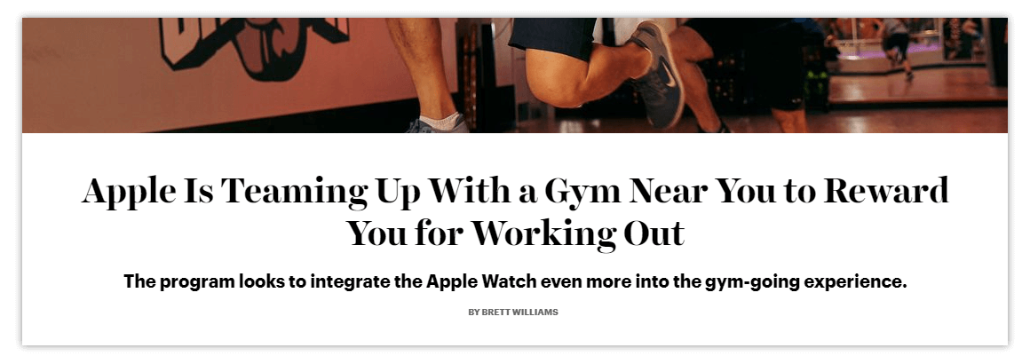
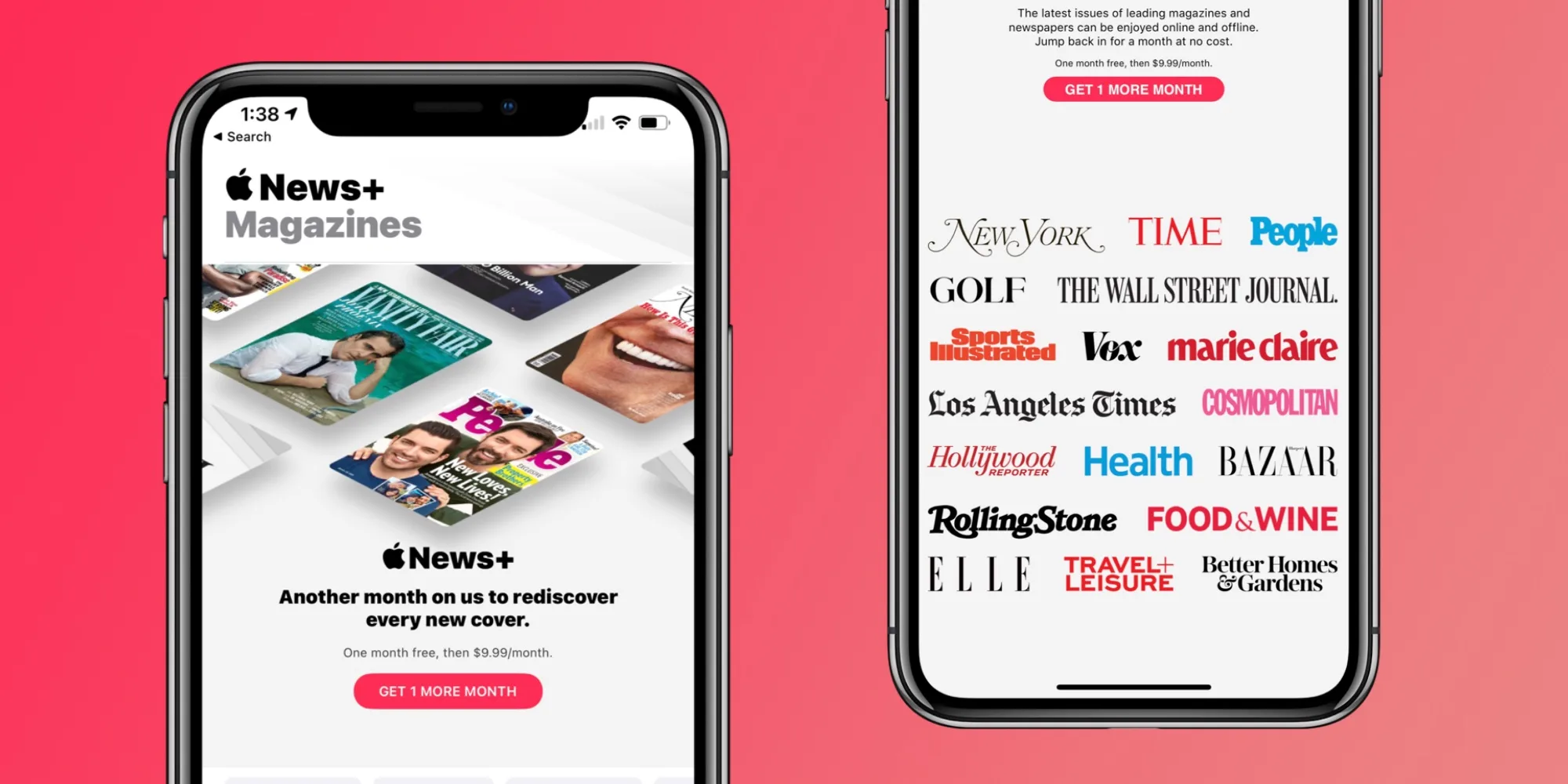
Consistency is key here, as the identity needs to be reinforced issue after issue, until readers can spot your content anywhere at a glance, whether it’s a display ad, a preview on Apple News, or a newsstand.
Layers of recognition can also be helpful – using different ‘out of the ordinary’ typography for your brand to highlight content that isn’t as regular as your weekly editions, like a ‘Word from the Editor’ piece, or a monthly roundup. In a readers eyes, that change in typography can be a clue that the content is something a little special.
Where To Find Fonts and Pairings
Hands down the best current resource for finding fonts is Google Fonts, a library of free licensed fonts available for any use, easily downloadable and filterable through a number of different categories.
Google Fonts also provides a number of ‘pairings’, fonts that work together within hierarchies, and can be found in their ‘Featured’ section.

